Given a map, which of the following fields can be placed on Size,Shape,Detail,Color
Correct Answer:B
Since Sales is a measure, it can easily be depicted via size.
To drill down and change the level of detail, Country is the correct choice since it
will contain STATE. We can then depict the various states by different shapes such as circle, square etc.
Finally, the Profit can be depicted via a color! Eg - Red for poor and green for excellent profits!
Reference: https://www.tableau.com/learn/tutorials/on-demand/aggregation-granularity-and-ratio-calculations
A union of two tables usually results in an
Correct Answer:B
From the official Tableau documentation:
You can union your data to combine two or more tables by appending values (ROWS) from one table to another. To union your data in Tableau data source, the tables must come from the same connection.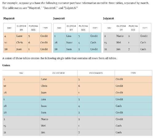
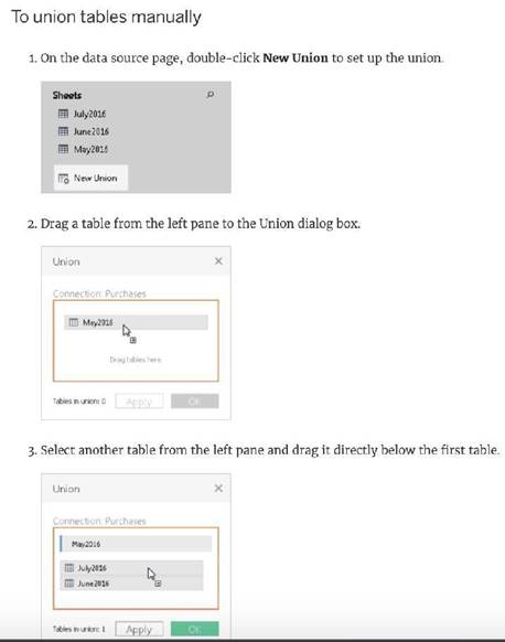

Reference: https://help.tableau.com/current/pro/desktop/en-us/union.htm
Which of the following are interactive elements that can be added to a dashboard for users?
Correct Answer:ABC
We can perform filter, URL and highlight actions out of the above given choices on a dashboard. Please refer to the image below: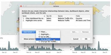
Reference: https://help.tableau.com/current/pro/desktop/en-us/actions_dashboards.htm
True or False: It is not possible to blend axes for multiple measures into a single axis
Correct Answer:A
We can very much blend multiple measures into a single axis. Such charts are called Combined-Axis / Blended-Axis charts. Follow along:
Measures can share a single axis so that all the marks are shown in a single pane. To blend multiple measures, drag one measure or axis and drop it onto an existing axis.
Instead of adding rows and columns to the view, when you blend measures there is a single row or column and all of the values for each measure is shown along one continuous axis. For example, the view below shows quarterly sales and profit on a shared axis.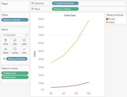
Note: If you drag a measure on to the canvas and only see a single ruler indicator instead of the double ruler indicator shown below, Tableau creates dual axes instead of a blended axis. For more information about how to create dual axes, see Compare two measures using dual axes.
Reference: https://help.tableau.com/current/pro/desktop/en-us/multiple_measures.htm
Which of the following are valid ways to copy a worksheet visualisation as an image?
Correct Answer:BD
The following are 2 correct ways to copy the worksheet visualisation as an image: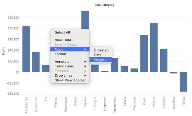
AND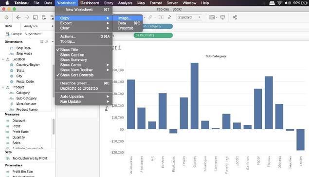
Reference: https://help.tableau.com/current/pro/desktop/en-us/save_export_image.htm