When creating a histogram in Tableau, to what does bin size refer?
Correct Answer:B
When creating a histogram in Tableau, bin size refers to the range of the continuous measure counted in each bin. A histogram is a chart that displays the shape of a distribution of a continuous measure. A histogram looks like a bar chart but groups values for a continuous measure into ranges, or bins. The basic building blocks for a histogram are as follows: Mark type: Automatic; Rows shelf: Continuous measure (aggregated by Count or Count Distinct); Columns shelf: Bin (continuous or discrete)4 To create bins from a continuous measure, you need to specify the size of bins, which determines how many bins are created and how wide they are. The size of bins is equal to the difference between consecutive values along the axis that represents the bins. For example, if you have bins with values 0-10, 10-20, 20-30, etc., then the size of bins is 10. You can either enter a value for the size of bins manually or have Tableau suggest an optimal bin size based on a formula that considers the number of distinct rows and the minimum and maximum values in the data5 The other options are not valid definitions of bin size when creating a histogram in Tableau. The minimum number of axis ticks in the view is determined by Tableau’s automatic scaling and formatting of axes, which can be adjusted manually if needed. The count distinct (COUNTD) of items on either axis is an aggregation function that returns the number of unique values in a field, which can be used as a measure in a histogram but not as bin size. The maximum number of marks in the view is limited by the performance and readability of the visualization, which can be improved by filtering, sorting, or aggregating the data4
In which of the following scenarios would having a live connection be more beneficial than using an extract?
Correct Answer:ABD
Extracts would be more beneficial for analyzing historical prices where we won't be making use of any real time data being streamed. Same is the case for enormous datasets having billions of rows (extracts will be more efficient in analyzing subsets of such large data).
As for live stock prices, flight updates, real time updates from production or mission critical systems - having a live connection is the most logical choice, since we need access to the most fresh and recent data possible at all times!
What are two benefits of using a live connection to a data source as compared to an extract? Choose two.
Correct Answer:BC
The benefits of using a live connection over an extract include:
✑ B: A live connection ensures that the data in the workbook is as up-to-date as the database itself, providing fresher data compared to a static extract which is updated at intervals.
✑ C: A live connection queries the database server directly, which means it uses the server's memory and processing power rather than relying on the client computer's resources.
A live connection does not necessarily require less network overhead (A) as it may continually send queries over the network, and it is not always faster than an extract (D) because extracts can provide quicker response times for complex queries or large datasets.
For a relative date filter, the default anchor is ______
Correct Answer:B
Relative date filters dynamically update to show a time period relative to when you open
the view, such as the current week, the year to date, or the past 10 days. Relative date filters make it easy to create views that always show the most recent data.
Step 1: Drag a date field to the filter shelf
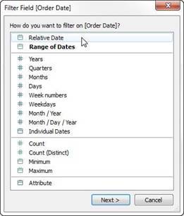
Right-click (control-click on Mac) and drag a date field from the Data window to the Filters shelf. In the Filter Field dialog box, click Relative Date, and then click Next.
Step 2: Select a time unit
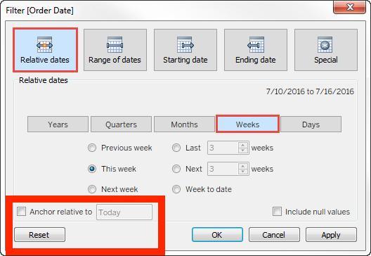
In the Filter dialog box, click Relative dates, and then select the unit of time for the filter. For example, to show only the three most recent weeks, select Weeks.
Here, you can clearly see that the default date is TODAY
Reference: https://help.tableau.com/current/pro/desktop/en-us/qs_relative_dates.htm
At a minimum, what do you need to create a simple scatter plot?
Correct Answer:A
To create a simple scatter plot in Tableau, you need to have a measure on Columns and a measure on Rows. A scatter plot is a type of visualization that shows the relationship between two numerical variables. In Tableau, you can create a scatter plot by placing at least one measure on the Columns shelf and at least one measure on the Rows shelf. The measures can be continuous or discrete, but they must be aggregated. The marks in the scatter plot represent the intersection of the values for each measure1 The other options are not valid ways to create a simple scatter plot in Tableau. A dimension on Detail and a measure on Columns will create a bar chart, not a scatter plot. A dimension on Columns and a measure on Rows will create a line chart or an area chart, depending on the mark type. A dimension on Columns and a dimension on Rows will create a text table or a heat map, depending on the mark type1